Perhaps I am a little late to the party as many bloggers have commented on Pantone‘s choice of a bright pink called “Honeysuckle” for Color of the Year already, but nonetheless, I cannot resist commenting. I don’t really see honeysuckle in the vibrant pink – usually I associate it with yellow or golden orange. Instead, I am thinking of the mid-winter ume (plum blossom) opening now against the cold, the first sign of winter’s turn towards spring. That is the bright pink they are talking about!
I think this kind of plum blossom pink looks best with the colors it appears with in nature – the blue and white of the sky and the dark brown of the branches. Decorating with pink has to be handled carefully. Pink unmoored, or paired only with white can look little girlish or nursery-like. But handled correctly, it can be sophisticated and warm. In this post I think I’ll start out as saturated as it gets and slowly take it down….
Mary McDonald is a master of intense color and in this bright pink hallway she pulls out all the stops with walls and upholstery covered in matching shades. The key to making all that pink work? The contrast of the gleaming mahogany, the zebra rug and all the blue and white porcelain. The golden chinoiserie mirror doesn’t hurt either. This is an entry that lets you know you’ve arrived!
Jonathan Berger uses Benjamin Moore’s “Razzle Dazzle” in this Brooklyn entryway. It’s a bold move that not all could live with, but it certainly jazzes up this small space. Note the blue and white porcelain (again) and the brown needlepoint upholstered chair, white paneling and dark stair risers, all of which help to balance the brightness of the shade.
This Windsor Smith living room, featured in the September 2009 issue of House Beautiful is one of my absolute favorite rooms, both in terms of the colors and the furniture. I have been tracking that scroll arm sofa and painted Indian coffee table through many variations in her homes and designs…Click here to see an earlier incarnation.
In the course of writing this post over the last weeks, I heard through the grapevine that the March 2011 issue of House Beautiful was going to feature pink. Guess how surprised I was to see this same living room as the cover feature! Am I wrong in thinking it is fairly unheard of for a major publication to feature the same space twice, without any major design changes??? Of course the issue has been on the newsstands for days now in the US, but I have yet to see it. This post may need a follow-up once I do! [Quick addendum: I got my hands on a copy and it featured “Ten Rooms They Couldn’t Forget”, so it was the exact same room from the original photo shoot. I guess they wanted to do a “pink issue” but it must be difficult to rustle up many new projects with pink in them. It actually made the magazine feel more like a blog post…kinda like this!]
Too much pink for you? Moving the pink off of the walls and onto the major upholstery and fabrics might be the way to go. Here, in another interior designed by Mary McDonald, pink fabrics play off the soft blue walls, and lots of wood furniture softens the design. Gotta love those bamboo armchairs, and, once again, the blue and white porcelain. [In reality, this room is red, and only looks pink in the photo. But lets all pretend anyway, since I think it is softer and prettier in pink!]
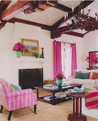
This Schuyler Samperton designed project has heavy wood beams that balance the vivid pink fabrics…or perhaps it is the other way round and the vivid pinks brighten and lighten up a heavy beamed space. Here turquoise has been used as the major accent color, along with woven rugs from Texas as a throw and upholstery, giving the room an updated ranch feel, slightly Southwestern. See Style Court for more photos of this room.
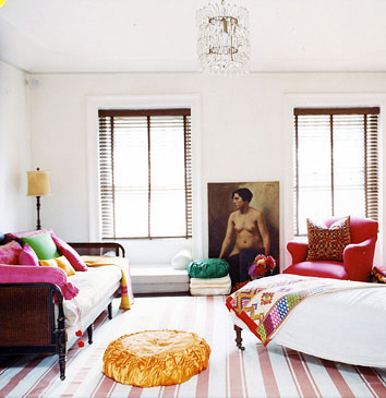
Another home that has influenced me and scores of others is Alayne Patrick’s Brooklyn home. Using amazing textiles and colors from India, she has put together a pink and white dhurrie, dark tropical feeling blinds and a cane daybed piled with pillows. I’d love my TV room/guest room at the beach to have this kind of feel.
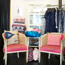
Patrick’s Brooklyn shop Layla has the same vibe as her home. I spent quite a bit of time there over the holidays searching for the perfect throw pillow. They reopen today after renovation and I really recommend a visit!
Sometimes a little goes a long way, as in actress Rashida Jones’ Manhattan studio, cleverly made over by Domino. The antique Persian helped set the palette with magenta and blue accents. White paint ties otherwise disparate furniture together and the wood edge of the sofa and touches of black ground the color scheme. Pale blue walls give the tiny space an expansive sky-like feel.
Would Rita Konig’s chair and her entire apartment actually, be the same without that shot of magenta? Again, a pale grey blue wall, soft as a cloud white window treatment and bits of dark wood in the frames.
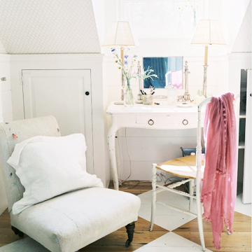
And finally, for those too afraid of a real pink commitment, I give you Deborah Needleman’s bedroom…All the components are there, it just takes that pink scarf to pull it together.
This can also be done with flowers, particularly a big bunch of pink peonies or some beautiful branches of plum blossom. I am cheating here, as these are actually redbuds, but you can get the idea…
The only downside to picking a “Color of the Year”? Calling anything “in” always implies that there is an “out” coming…
Image credits: 1. Pantone, 2. me, 3. Mary McDonald, 4. House Beautiful July 2009, photo credit: Francesco Lagnese, 5. House Beautiful September 2009, photo credit: Victoria Pearson, 6. House Beautiful March 2011, 7. Mary McDonald via mydeco, photo credit: Miguel Flores-Vianna, 8. Schuyler Samperton via style court, photo credit: Lisa Romerein 9 & 12. Domino May 2007, photo credit: Melanie Acevedo, 10. The New York Times, 11. Lonny Magazine October/November 2009, photo credit, Patrick Cline, 13. Domino March 2006, photo credit: Mikkel Vang.


I could totally live with that Razzle Dazzle pink paint color in the Jonathon Berger small entry space…LOVE it!
I got my House Beautiful this week in the mail, but I did see it at National Azabu last week and took a sneak peak, sunglasses required, way too much pink for my liking, overdose comes to mind! Personally I love a shocking pink accent in the form of a pillow, flowers (of which I have sitting on my mantel) or a cyclamen plant that I have in my office space, a great “pop”, but I could not live with the whole encapsulating vibe, way too sickly, plus I think that you would have to have a very understanding husband! I agree with your comment early on in the blog, if paired with the natural colours such as blue and brown as seen in nature with the ume, then perfect. I recently bought Kathryn M. Irelands Creating a Home where she too uses hot pink along with most other colour of the rainbow, the verdict is still out on whether or not I could live with all those colours used together, again a pop or two of colour against a neutral backdrop is probably more my thing, is it called “playing it safe”? I have never been too adventurous.
Love the post, keep up the great work!
Jonathan Bergers Entry has me drooling too! Kaz would freak! If its going to be pink it has to be that vibrant pink, erring on the blue. John Oliver ( UK) stocks that very color for those interested it is named “Kinky pink”..
Just taken delivery of “Washi” very same color! Love it!
I knew this post was going to be a love it or hate kind of post!!
Do you think the walls were repainted in the Windsor Smith living room? Actually everything looks darker in the first incarnation and lighter in the second so it would suggest a difference in the lighting and angle when the photos were shot.
Incidentally, even before getting to the last sentence regarding Alayne Patrick’s home I was looking at the picture and thinking the exact same thing about your TV room.
No, I think it is the same photo shoot actually, just the difference in the digital images and the angle. I am sure the room was not repainted…
I still like bamboo better
I gave you the “Memetastic Award”- go check my page….Congratulations on a great blog!
I loved this post. I never realized how warm and alive (and soothing at the same time) a deep pink could be. It’s also very flattering to anyone in the room. I remember my mother buying pink light bulbs for that effect. Thank’s for another good read.
I love the pink light bulb idea…Thanks for your comment!
I heart this post. I really do love my share of pink. I would not have considered pairing the blue and white porcelain with pink but now that I see the Ume blossoms against the blue sky and white clouds – it seems like such a natural pairing. I am wondering how the blue and white Sarah Brayer print would looks against a pink wall? Hmm…
Sarah Brayer would look perfect with pink, especially if we pulled in an Indian block print with some blues/pinks in it!
loved your article and thanks for your comment.
you know – that mary mcdonald room you showed with the console table – that room is red, not really pink at all though it looks like deep pink in that photo. the entire house is a vivid red.
and people are saying the HB cover has been photoslopped because the pink walls looked so much lighter.
thanks again!!!
Joni
I secretly knew that about the M McD room – but I wanted to use it anyway….And they did photoshop the paintings off the cover to have room for the words…I think they lightened the color too…
I knew the room was really red, but I like it so much as a pink example, I coudln’t bear to leave it out. I have added a little addendum comment to clarify!
O-Hanami Decorating…Pale Pink Bedrooms for Cherry Blossom Season « Tokyo Jinja
[…] Related Post: Ume Blooming…Maybe Pantone Should Have Called Their Color of the Year Plum Blossom? […]