
 We are finally ready to tackle the main big project here at the beach house – the kitchen – so I’ll be posting all week on the subject. This was the original photo in the real estate listing and certain things were clear from the very beginning, including the fact that the kitchen was not very big at approximately 9 x 12 feet but that it was bright and sunny. In addition to 4 windows, the pair you see here and the larger pair over the sink, it had 3 doors, one in from the dining room, one leading back to the small side room we converted into a TV room and another door out to the porch which you can see open on the left of the photo. That leaves a fair amount of wall space challenge. Add to it the yellow paint and child-like wallpaper border, old linoleum floor, faux butcher block counter, grody uncentered sink with one of those tiny side compartments for the disposal and 1970s style laminate cabinets and you can see we have our work cut out for us. It doesn’t help either that the base color of all the appliances is almond which is definitely not my cup of tea.
A photo on the day we took possession does reveal the lovely french doors into the kitchen from the dining room. Unfortunately, the refrigerator sticks out so far that it is all you really notice when looking in from this angle. I’m going to take you on a tour, counter-clockwise as you enter.
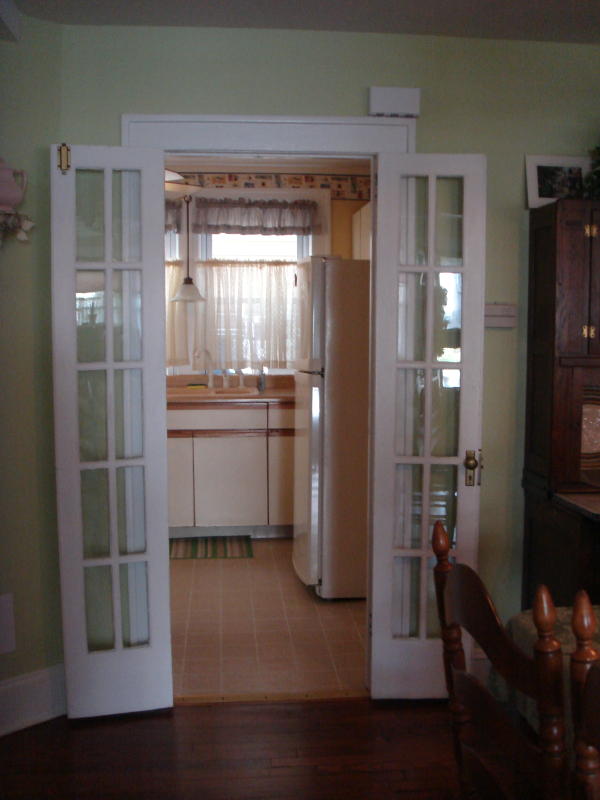
A left turn through the door brings you to this cabinetry, which effectively blocks the door out to the porch. Note the aforementioned laminate cabinets and counter in all its glory.

Pivot 90 degrees to the side wall which had a table shoved against it in the real estate photo which would have kept you from opening the porch door or the oven. The curtains obscure a pretty shaped pair of original windows and are not at all necessary for privacy.

Pivot again and you are facing the back wall which has the stove on it. You can see a vintage kilim I brought from my house in Tokyo in the hopes that it would be a good color for the room and cover quite a bit of the grimy floor. Note one of my absolute favorite features of the kitchen (not!) – the side by side appliance look of the stove and dishwasher.

The sink has beautiful windows as well, also obscured by very unmatched curtains. The sink itself is made of some awful material that never looks completely clean and is an ugly pinky beige. The faucet isn’t centered on the window and the disposal side of the sink is almost useless.

Pivot again and you come to the wall on the right side of the kitchen as you enter, blessed with the behemoth fridge. As it sticks out so much, it basically renders this corner unusable.

And sliding your eye along brings you to the two remaining doors – the first one straight on being the original entrance to the now TV room, and the door frame mostly out of view on the right heading back out to the living room. Take note of the double door space leading into that extra room as there is a fairly deep vestibule between the two door frames that will eventually prove useful.

Now we have certainly managed to make some basic improvements since we moved in, including painting the kitchen Benjamin Moore Linen White – perhaps this post should really be called “The Magic of a Coat of Paint” – which has made the kitchen very tolerable. Linen White is not one of my favorites, but it is my mother’s long-term go to color (and thus a fixture of my childhood) for all things almond and a very close color match to the cabinetry. The other instantaneous change came after we took down all the curtains. The kilim really does help too, especially now that the bright yellow and primary colored border is gone. I’m doing a matched tour below, photo by photo, and just this view alone gives you a sense of how much has changed (although that fridge still is a behemoth!)

We removed the upper cabinet on this wall soon after moving in as it made the room feel very closed in. Being here for just the summer means that we just don’t need that much storage, so it was no loss. We also took out the lower cabinet planning to get rid of it too and float a small island instead, but we made the unexpected discovery that there is a hole in the linoleum underneath so for now it has to stay. The good news is the hole confirmed our belief that there is good wood floor under all that linoleum. That’s a check in the plus column for sure! I’m looking forward to restoring the transom above the porch door too.

This is what I meant about these windows having a lovely shape. And the trellis outside provides privacy. Don’t you think it would be charming to have small flower pots hung European style on the trellis so when you look out you have a pretty view?

Only recently, the faux tile behind the stove came loose, so I am pulling it out tomorrow and painting behind there too.

And a pretty half sheer may be necessary here if I can’t get the neighbors to hang their beach chairs lower!

Copper, baskets and no more ugly wallpaper border here.

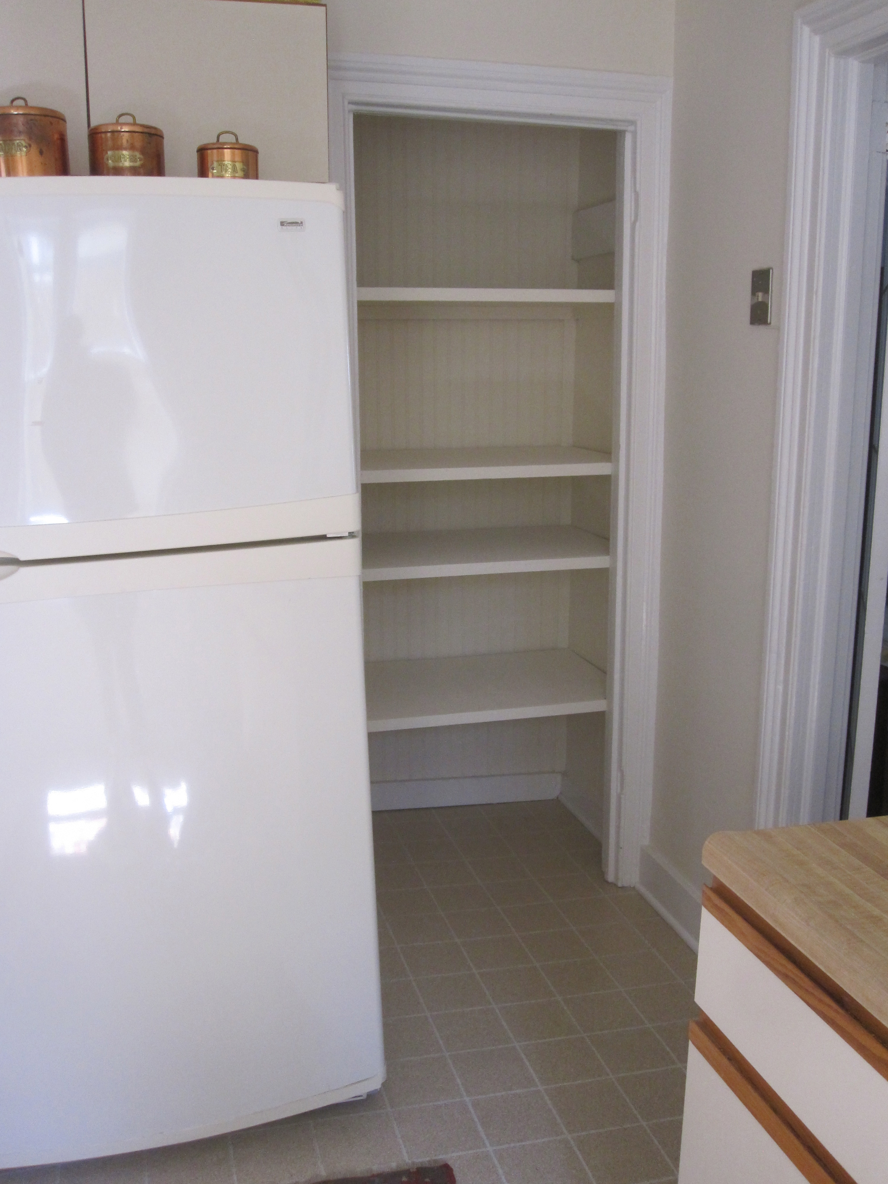
The most major change came with our renovation of the TV room and downstairs bathroom in which we sealed the entrance from the kitchen and turned it to open into the living room/dining room. A full post on that renovation can be found here. The net benefit in the kitchen besides the improved traffic flow is the gaining of a pantry.
So this is where we stand today. Plain and functional but not my ideal. In the next few days I’ll be showing you what I wished was here and my ideas – both high and low – of what we might do.
If you are interested in seeing more of our beach house progress, earlier posts can be found in the Renovation and Decoration Report.
Dated but not horrible. At least it’s got light. That’s one thing you can’t change. My interest is piqued.
The kitchen has come a ways from its original self already – wow! Love all the light too – huge bonus. Can’t wait for the next installment…
(I called you the wrong name! I know that is not your name!!)
A compliment to be called or confused with Loi! :-)))
we are all fans of Loi!
I realize you cannot paint those cabinet fronts! (Can you paint formica?? Maybe!) But you can get just “cabinet fronts”!
Good luck!!
I agree, already a huge improvement!